
vue3中自定义一个简单键盘
- vue3开发
- 2023-10-20
- 571热度
- 0评论
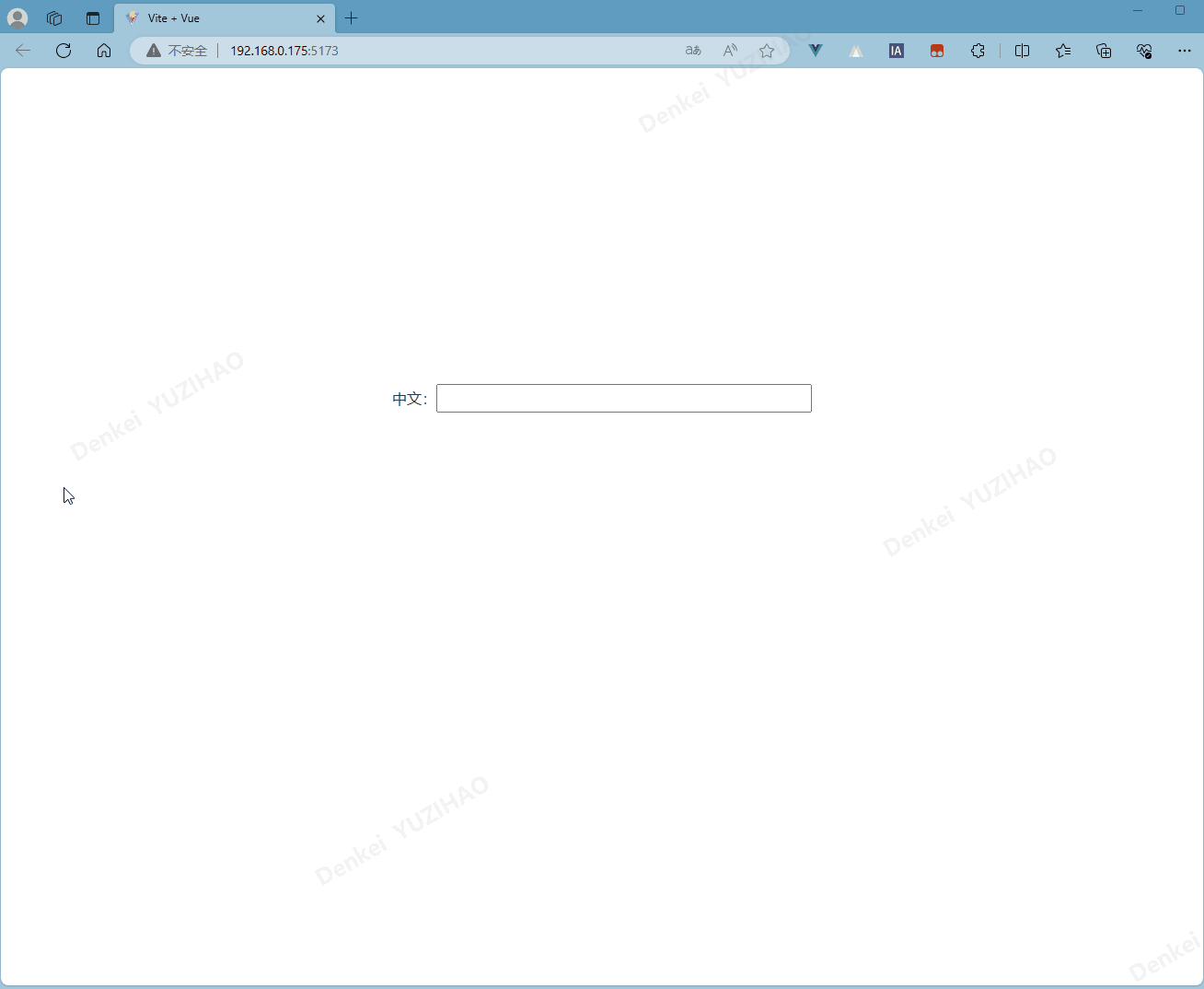
自定义图片实现效果:
实现功能:输入框中获取焦点时,弹窗出自定义键盘,键盘可输入数字。在代码keyboardList中可以修改按键中的字符,具体代码如下:
<template>
  <div class="container">
    <el-input
      ref="inputRef"
      type="text"
      @click="isInputChoose = true"
      v-model="number"
      clearable
    />
    <Transition name="bounce">
      <div class="keyboard" v-if="isInputChoose">
        <el-icon @click="closeKeyBoard"><CircleClose /></el-icon>
        <div class="grid-container">
          <div
            class="grid-item"
            v-for="(item, index) in keyboardList"
            :key="index"
          >
            <button @click.prevent="enterKeyBoard(item.value)">{{ item.label }}</button>
          </div>
        </div>
      </div>
    </Transition>
  </div>
</template>

<script lang="ts" setup>
import { nextTick, ref } from "vue";

// 按钮按键列表
const keyboardList = [
  {
    "value": 1,
    "label": 1
  },
  {
    "value": 2,
    "label": 2
  },
  {
    "value": 3,
    "label": 3
  },
  {
    "value": 4,
    "label": 4
  },
  {
    "value": 5,
    "label": 5
  },
  {
    "value": 6,
    "label": 6
  },
  {
    "value": 7,
    "label": 7
  },
  {
    "value": 8,
    "label": 8
  },
  {
    "value": 9,
    "label": 9
  },
  {
    "value": 0,
    "label": 0
  },
  {
    "value": 11,
    "label": "清除"
  },
  {
    "value": 12,
    "label": "确认"
  },
];
let number = ref("");
let calNumber = ref("");
const inputRef = ref();
let isInputChoose = ref(false);
//触发按钮事件
const enterKeyBoard = (value: any) => {
  if (value != 11 && value != 12) {
    number.value = number.value + value;
    nextTick(() => {
      inputRef.value.focus();
    });
  }
  if (value == 11) {
    number.value = number.value.slice(0, -1);
  }
  if (value == 12) {
    calNumber.value = number.value;
    isInputChoose.value = false;
  }
};
//关闭键盘
const closeKeyBoard = () => {
  isInputChoose.value = false;
};
</script>
<style lang="scss" scoped>
.container {
  width: 100%;
  .keyboard {
    .el-icon {
      float: right;
      font-size: 50px;
      padding: 20px;
      z-index: 1000;
      cursor: pointer;
      :hover {
        color: #009688;
      }
    }
    background-color: rgba(0, 0, 0, 0.5);
    width: 98%;
    height: 50%;
    bottom: 0;
    position: absolute;
    .grid-container {
      display: grid;
      justify-content: center;
      grid-template-columns: repeat(3, 20%);
      grid-template-rows: repeat(4, 30%);
      grid-gap: 10px;
      width: 100%;
      height: 30vh;
      position: fixed;
      z-index: 999;
      top: 55%;
    }

    .grid-item button {
      width: 100%;
      height: 100%;
      border-radius: 20px; /* 圆角矩形 */
      box-shadow: 5px 5px 12px 5px rgb(0 0 0 / 20%);
      background-color: #009688;
      cursor: pointer;
      border: none;
      color: white;
      font-size: 30px;
      font-weight: bold;
      transition: background-color 0.3s;
    }

    .grid-item button:active {
      background-color: #c9c9c9;
    }
  }
}
.bounce-enter-active {
  animation: bounce-in 0.5s;
}
.bounce-leave-active {
  animation: bounce-in 0.5s reverse;
}
@keyframes bounce-in {
  0% {
    transform: scale(0);
  }
  50% {
    transform: scale(1.25);
  }
  100% {
    transform: scale(1);
  }
}
</style>
![vue3+pinia+ts开发时,报错[🍍]: “getActivePinia()” was called but there was no active Pinia. Did you forget to install pinia? const pinia = createPinia(),解决办法](https://dekuyu.top/wp-content/uploads/2023/07/图片2.png)